Client
Pedro Martínez Foundation
Role
Web Design
Tools
Client
Role
Tools
Client
Role
Tools
For 20+ years Pedro Martínez Foundation has worked in the community of Manoguayabo, in the Dominican Republic, where they have implemented projects in favor of children’s education.
The website needed a redesign so that contributors could learn more about the projects, and in the same place, they could also donate to any of the programs to be part of the development of the youth in the area.
Initially, the project consisted of a single page, which represented a challenge, since it required that all the documentation provided be in one place, for this reason, I made certain decisions to achieve a condensed design without omitting any relevant information.
Initially, the project consisted of a single page, which represented a challenge, since it required that all the documentation provided be in one place, for this reason, I made certain decisions to achieve a condensed design without omitting any relevant information.


One of the ways I was able to present important information in a manageable way was by creating icons. The foundation has made a huge impact in the community and I thought it was appropriate that their contributions be at the top of the site so that the visitors can get a glimpse of what the foundation has done over the years.
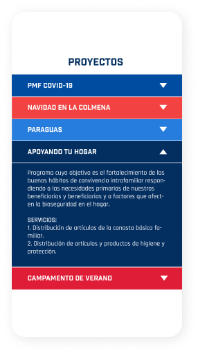
Being several projects in which the foundation is involved, I maintained the approach of condensing the information by implementing a toggle-type format, allowing visitors to read all the details of each project and at the same time not compromising the space designated for each section.

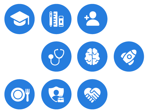
One of the ways I was able to present important information in a manageable way was by creating icons. The foundation has made a huge impact in the community and I thought it was appropriate that their contributions be at the top of the site so that the visitors can get a glimpse of what the foundation has done over the years.
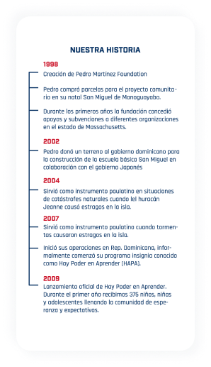
In general, the history of institutions is not always the most engaging part of a web page. Long paragraphs might cause many to skip this part, so I considered implementing a timeline format to make the text easier to read, highlighting the most relevant events in the institution’s history to date.

Being several projects in which the foundation is involved, I maintained the approach of condensing the information by implementing a toggle-type format, allowing visitors to read all the details of each project and at the same time not compromising the space designated for each section.
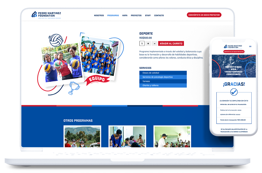
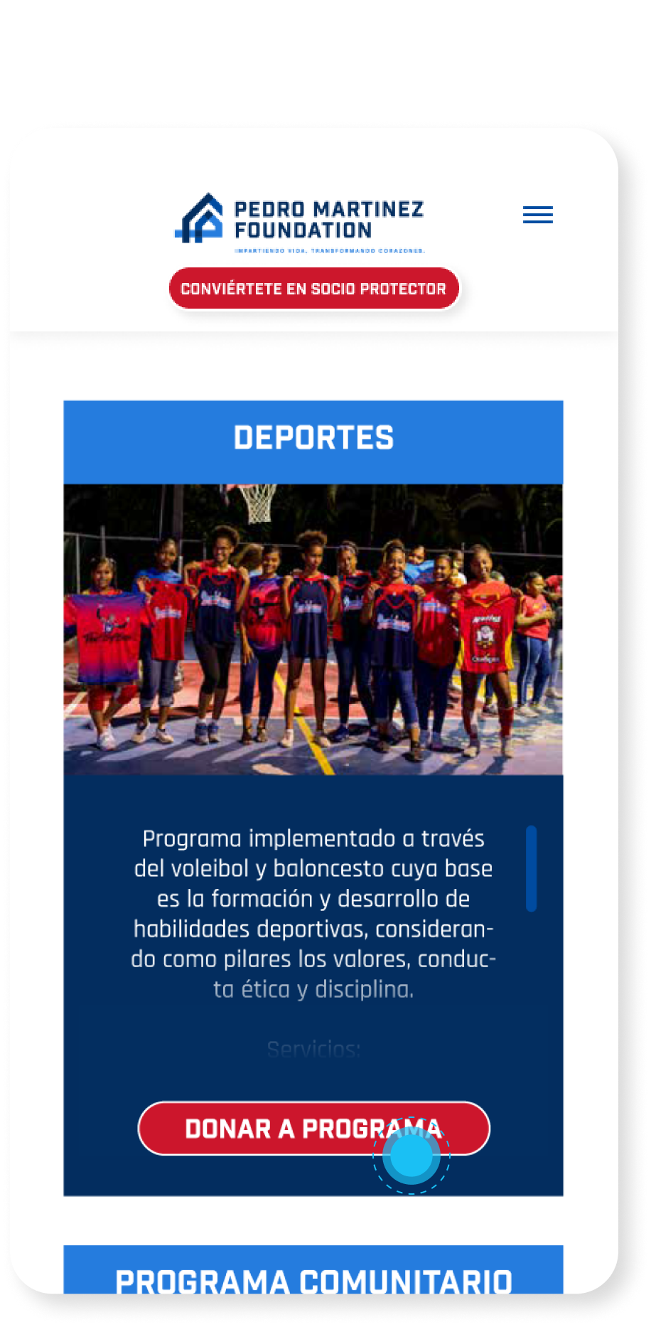
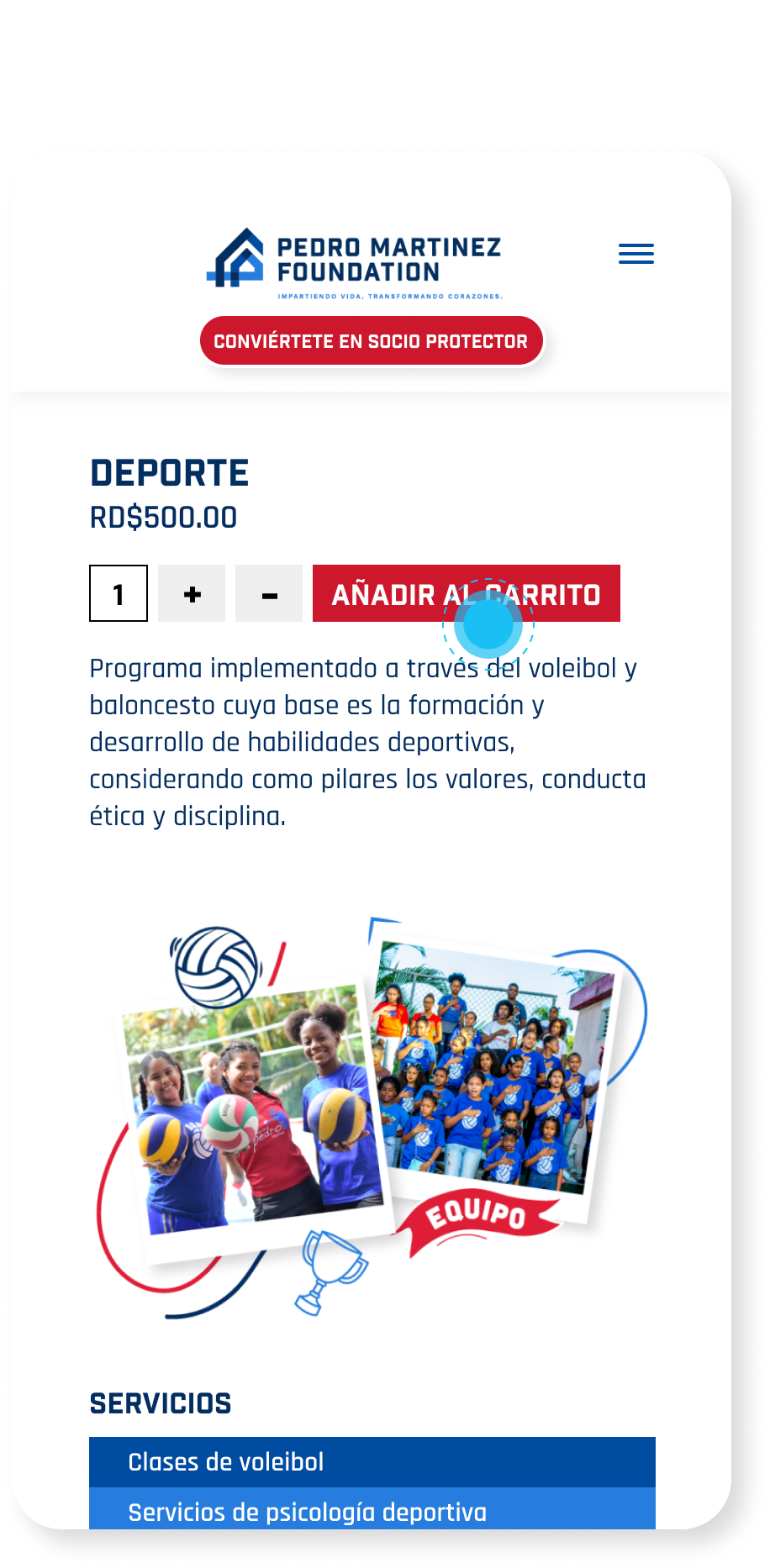
Once the first part of the project was completed, the need arose to dedicate a full page to each program where users could see everything related to these projects and from there start the donation process if they wished.
With the expansion of the project, we also have more room for these new pages, so there were no limitations, and that translated into more opportunities to set and illustrate the content, where the programs have images (as in instant photography format), depending on the theme of each one.
Once the first part of the project was completed, the need arose to dedicate a full page to each program where users could see everything related to these projects and from there start the donation process if they wished.
For these new pages, doodle-type illustrations were integrated around the photographs, taking into account the concept of each project. These original illustrations could then be integrated into any other graphic piece required by the institution where its programs are mentioned, both on its website and on any of its platforms.
With the expansion of the project, we also have more room for these new pages, so there were no limitations, and that translated into more opportunities to set and illustrate the content, where the programs have images (as in instant photography format), depending on the theme of each one.
For these new pages, doodle-type illustrations were integrated around the photographs, taking into account the concept of each project. These original illustrations could then be integrated into any other graphic piece required by the institution where its programs are mentioned, both on its website and on any of its platforms.
Once the first part of the project was completed, the need arose to dedicate a full page to each program where users could see everything related to these projects and from there start the donation process if they wished.
With the expansion of the project, we also have more room for these new pages, so there were no limitations, and that translated into more opportunities to set and illustrate the content, where the programs have images (as in instant photography format), depending on the theme of each one.
For these new pages, doodle-type illustrations were integrated around the photographs, taking into account the concept of each project. These original illustrations could then be integrated into any other graphic piece required by the institution where its programs are mentioned, both on its website and on any of its platforms.
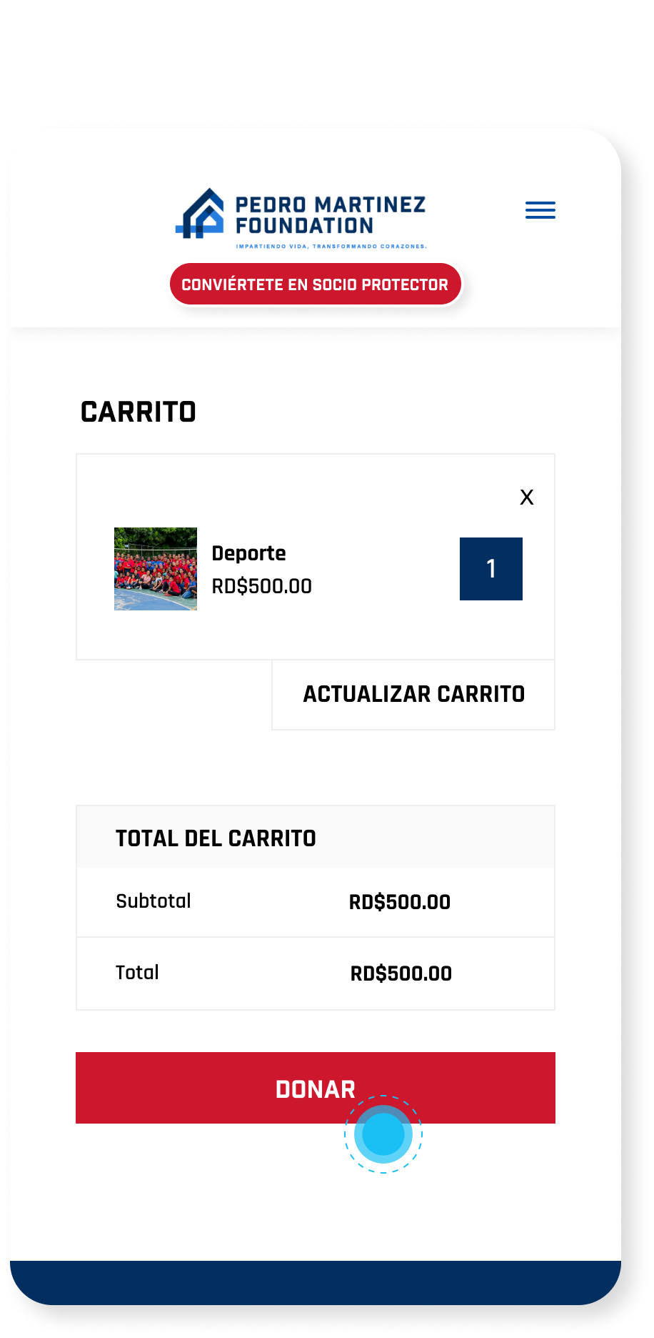
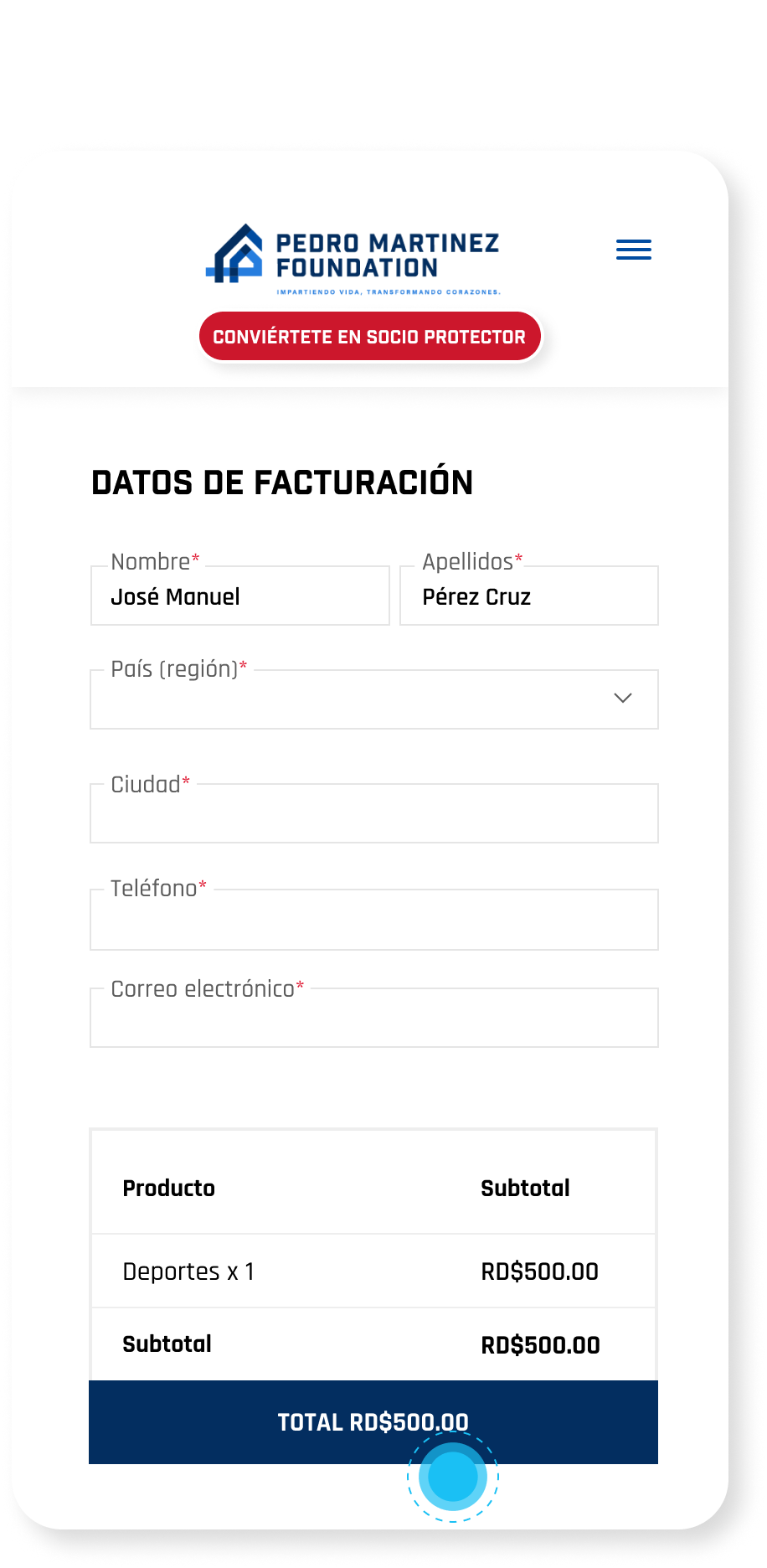
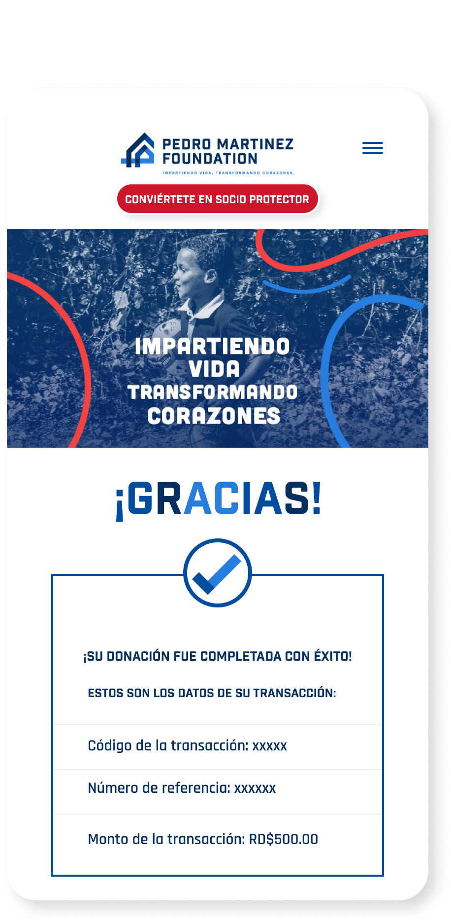
Finally, after reading about the programs, visitors could start the donation process, selecting the desired amount, filling out a form with their personal data and once the details of the transaction were confirmed, they received a notification with all the information related to their donation.
Finally, after reading about the programs, visitors could start the donation process, selecting the desired amount, filling out a form with their personal data and once the details of the transaction were confirmed, they received a notification with all the information related to their donation.